I wish Intuit would use some of that enormous lobbying budget to get a law in place where all the banks need to provide an API.
My 7-year-old just fired me from the building project I was working on in our shared Minecraft world. “I suggest you work… on other things. I’ll make it properly and we’ll find some other things for you to do.” #PerformanceReview
The only thing worse than being on hold for three hours is that two days later I still have the hold music stuck in my head. I’ve put myself on hold.
The kids will be… alright?

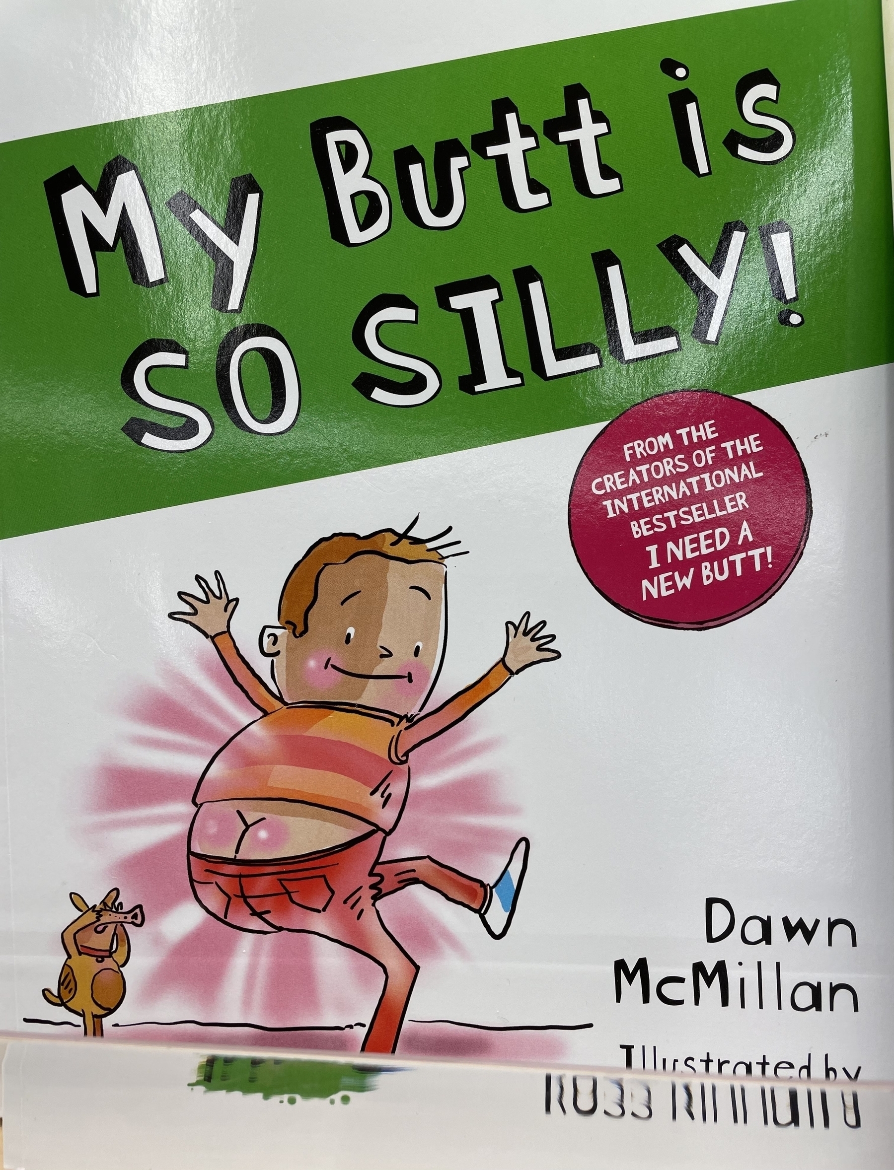
My kiddo is having some trouble learning how to read. The Meg and Greg books have helped enormously. They focus on phonics, not boring stories, and split reading. Highly recommend for kids 5-8.
People add “reddit” to their searches to get results without SEO spam. What’s amazing is this works because Reddit has human moderators. We’re still not at a place where automatic moderation can fully do the job. And, I bet generative AI makes the gap even wider.
I can’t say enough good things about the Double Fine Psychodyssey series. It’s an incredible look behind the scenes of the making of Psychonaughts 2 over 6 years. You’ll laugh, you’ll cry, and you’ll empathize with people trying to do their creative best.
I hope that the success of Cocaine Bear convinces Hollywood to fund the Snakes on a Plane sequel that we all deserve.
I wonder how different the world would be if XML had won.
Startup idea: Start a call from the app and it’ll stay on hold for you until someone real answers and presses a digit and then it’ll warn you.
This hits too close to home…
Correspondence with My Preschooler Regarding Our Updated Dinner Policy
I’m going to be fascinated to see how much AI changes interaction design. There’s an opportunity here to make interfaces that fit what humans need.
Friends don’t let friends use AWS Glacier.
A disaster movie where all at once, for some inexplicable reason (aliens?), CRON stops working, everywhere.
Startup idea: a phone number you can use as two-factor for banks that removes the whole “phone” part of the equation.
I believe there’s room in the world for a really good Star Trek video game… but it hasn’t happened yet.
“In early 2021, Yachty was reported to be producing and starring in a live-action movie based on the UNO card game, which is being developed by Mattel Films.”
And I thought Battleship was a challenge. UNO is hard mode. Good luck to the screenwriter.
I was getting a bunch of spam calls every day. It was very frustrating, so I signed up for RoboKiller. Now I’m so used to not getting interrupted, I can’t cancel. It’s like an ad blocker — I’m stuck with it.
Me: Ok, time to go to sleep. I have to be up early tomorrow.
My Brain: It says here that the CIA developed exploding seashells in an attempt to assassinate Castro. This seems very important.
I’m really late to this party, but it turns out that Focus Modes are great.
My 7-year-old does not understand the “Hello Computer” joke from A Voyage Home. You can just talk to computers now… it’s no longer funny. (Unrelated: I’m old.)
The Besties 2022 Game of the Year two-part podcast was excellent. Lots of discussion about why people even like games at all, and some quality behind-the-scenes critical evaluation. overcast.fm/+nApkDoWs…
I’m trying to resist learning Rust SO HARD, but spending time on Hachyderm is not helping. Can’t. Fit. Another. Language.
Survivor, but to get food contestants need to write correct regexes.
The constant difficulty I have in choosing between programming languages makes me think I just really like programming. This must be how some people feel about shoes.